
Going mobile is not a wishful thinking anymore and everybody who does not optimize for mobile will suffer next year. A bold statement I have made recently in front of an audience that had seen their site traffic patterns leaping from 2% to 25% mobile just in the last 6 months of 2014.
Why was I so brave making this “mobile future” disclosure? Am I Nostradamus or do I have any relatives in Google. Neither. Earlier this year we saw mobile browsing/search experience overtaking desktop for the first time in the history of Internet. Now in the end of the year numbers are looking something like that:
- Four out of five consumers are using their mobile phones when shopping.
- 75% of online searches lead to an action within an hour. My explanation to this one: When searching using your mobile you are looking for something specific. Few people are using their mobile devices just to browse the internet for fun compare to desktop. You see something in the newspaper, you notice an advert on the passing by truck, a colleague tells you about an offer on the High Street. What’s your first reaction? Check it out on your 4.5 screen right there on the spot.
- 25% of smartphone owners ages 18–44 say they “can’t recall the last time their smartphone wasn’t next to them.” (Fast Company).
- Now the funny one. Another recent study claims that at least 70% of Americans take their phone to the bathroom. My verdict: If you are somehow involved in the toilet paper business it’s such a crappy time not to have a mobile friendly website.
- 189 million Facebook users are mobile only. This figure is something like one in five. If your visitors are coming to your website through articles or advertising on Facebook then they are more likely to be mobile visitors rather than desktop. There is just no point advertising on Facebook, a platform full of mobile users, if your website is not Mobile friendly. To cement this point look at the next statistic.
- 50% of people admit that they will never visit a website on their mobile if they had problems accessing it on their device. Staggering number.
“Addressing your mobile audience is a critical part of any digital marketing strategy. Less than 2 weeks ago I sat in meetings with one client that told us that 35% of their traffic comes from mobile devices today. This makes mobile readiness a necessity!” said Eric Enge when releasing the mobile friendly version of his company website in March this year.
In another statement David Amerland claims that “a website that is not mobile-friendly is not only missing out of a large slice of visitors but it is also setting itself up to receive a black mark in ranking in search.”
What is going on? Why is Google penalising us for not having a mobile friendly version of our site? According to Google own research “mobile-friendly websites provide a much better user experience for the mobile users. According to our studies, 61% of users are unlikely to return to a mobile site that they had trouble accessing from their phone. That includes sites that use fonts which are illegible on mobile, or sites where users have to zoom in or pan around excessively. Mobile is a very important area; the mobile device penetration is over 50% in the USA and most users use their device for browsing websites. Because at Google we are aiming to provide a great user experience on any device, we’re making a big push to ensure the search results we deliver reflect this principle. We want users to be able to enjoy the web wherever they are.”
So I am afraid folks it’s official. Google will penalise you if your website is not providing the necessary mobile user experience.
After saying everything above I was not at all surprised when 3 days ago Google introduced a new feature in Webmaster Tools called Mobile Usability. Main purpose of the new tool is to help marketers and website owners identify mobile usability issues across their websites. I like the Google definition of a proper implementation of a mobile friendly site: when reading visitor should only scroll up and down and at no point one should swipe from left to right in order to see content.
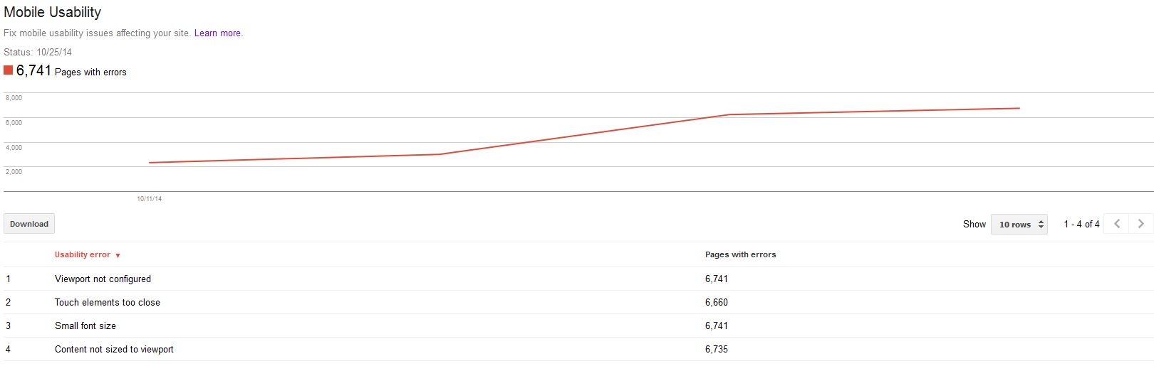
The Mobile Usability Report will show issues like:
- Flash content – most mobile browsers do not recognise/render content created with Flash. Good time to say: Stop using Flash even for desktop. HTML5 has been around for so long that it is time for you to come to the 21 century.
- Viewport not configured – start using the meta viewport tag. People are coming to your web page from different mobile devices, so specifying a viewport is critical for the mobile experience of your website.
- Tiny fonts – if you see this one then after specifying a viewport set your font sizes to scale properly within the viewport.
- Fixed-width viewports – some of you will define the viewport to a fixed pixel size in order to adjust a non responsive page to cater for different size mobile screens. I am afraid you have to adopt a more responsive approach and set the viewport scale accordingly.
Quick tip: <meta name=”viewport” content=”width=device-width, initial-scale=1.0″> - Content not sized to viewport – as I said earlier Google vision for a mobile friendly website is one that does not require vertical scrolling. problems coming with absolute declarations in CSS and images not scaling. Quick tip: width: 100% instead of width:360px.
- Touch elements too close – As visitors are not using the more traditional mouse cursor it is very difficult for them to press buttons and links densely packed. Ensure buttons and navigational links are correctly sized. Quick tip: The average adult finger pad size is about 10mm wide, and if you check the Android UI guidelines you gonna see that the recommend minimum tap target size is 7mm, or 48 CSS pixels on a site with a properly-set mobile viewport.
In Conclusion….
The Digital Marketing Landscape has dramatically changed in 2014. The number of customers using mobile while browsing the internet is on the rise, so a lot of people now are asking the question, and that is “What is my mobile strategy? Do I have one?” My advice is – do not panic as yet, but start moving towards a well defined and structured mobile strategy as soon as possible.
Your initial point should be the Google ideal for mobile friendly website.First it was Google’s Page Speed Insights tool gaining mobile usability in it’s tool and now Webmaster Tools. Mobile Usability MATTERS.
Your “middle ground” should be the ever evolving Semantic Web and Semantic Search. Because we live in the dawn of the Semantic web where a lot of mobile search queries are done by a voice recognition system, Google had to do something in order to cater for his mobile users. As we all know most of the mobile searches are so called “long tail” containing “entities” mentioned in them. To predict its customers queries Google have moved from a simple keyword search system to a lot more complicated one that uses “entities” to find relationships. Optimizing for Semantic search is crucial for your business.
Your end and ultimate goal should be the overall customer experience.