Discover the evolution of the iconic Google logo over the years
Google, the world’s most popular search engine, has a logo that is instantly recognisable everywhere in the world. Unless you have never used Google to find anything, you probably know the colour of the Google logo letters. The Google logo has gone through several changes since the company’s establishment in 1998 (God, I am getting old), and each iteration has had its unique significance and meaning. In this article, we will explore the history of the Google logo and its significance.
The original Google logo
Google was founded in 1998 by Larry Page and Sergey Brin – they met at Stanford University while studying for PhD in computer science. They came up with the so-called Google PageRank algorithm and the rest is history. Initially, the Google logo was a simple wordmark, consisting of the word “Google” in black letters with a small blue “g” at the end (the name Google came from a mathematics word called googol).
Apparently, the original Google logo was designed by Sergey Brin using GIMP, an open-source image editing software. The first logo was simple, clean, and unassuming, reflecting the company’s focus on providing an easy-to-use and intuitive search engine.
Over the years, the Google logo has undergone several changes, with each iteration reflecting the company’s growth and evolution.
The First Major Change
The first significant change to the Google logo occurred in 1999, just a year after the company’s inception. The new logo featured a slightly different shade of blue and a more prominent “g.” This change was made to give the logo a more modern and playful look.
The Second Major Change
The second significant change occurred in 2010 when Google introduced a new logo to commemorate its 12th anniversary. The new logo was more colourful and had a more modern look and feel. This change was made to reflect the company’s ongoing commitment to innovation and technology – nobody can contest this commitment as nowadays Google is a multinational technology company focusing on online advertising, search engine technology, cloud computing, and computer software to name but a few.
The New Google Logo
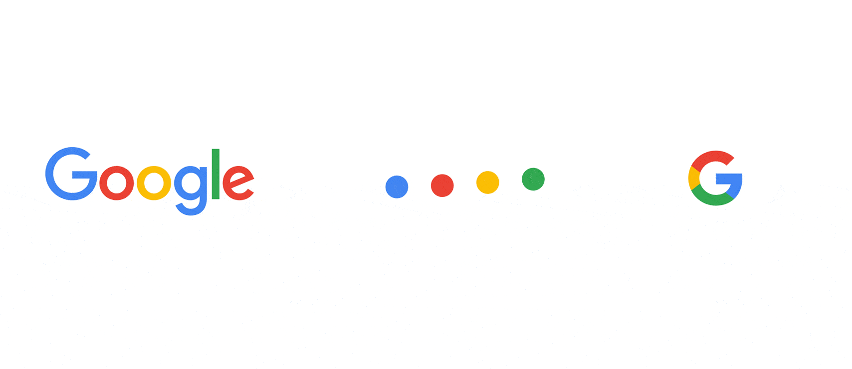
In the year 2015, Google made the most significant change to its logo since the company was founded. The 2015 logo was designed to be a lot more modern, playful, and flexible. The new logo featured a sans-serif typeface (Open Sans is a humanist sans-serif typeface designed by Steve Matteson) and a bright, bold colour palette.
The new 2015 logo was designed to be more versatile and work across a variety of platforms, including mobile devices (that were on the rise in 2015) and of course social media. The company also introduced a new icon, known as the “Google dots” which was a series of four coloured dots – blue, red, yellow and green – that represented the company’s four core values: innovation, simplicity, usefulness, and fun. The famous Google “G” favicon has been used since September 1, 2015
The Significance of the Google Logo
The Google logo is more than just a simple design. It is a visual representation of the company’s values, culture, and brand identity.
One of the key aspects of the Google logo is its use of colour. The bright, bold colour palette is intended to reflect the company’s playful and innovative spirit (as of the writing of this article February 2023 Google has a total of 79965 patents globally, out of which 30212 have been granted. Wow). The use of primary colours also reflects the simplicity and accessibility of the company’s search engine.
The sans-serif typeface used in the logo is also significant (notice that they didn’t come up with their own typeface). The typeface is simple and modern, reflecting the company’s focus on innovation, technology and the future of mankind. It is also highly readable, making it easy for users to identify and remember the Google brand.
The introduction of the “Google dots” was also significant. I literally see the “Google Dots” as a secondary logo, a conscious decision on their part to portray Google’s drive to think out of the box. I don’t think that before the introduction of the “Google Dots” any graphic designer in the world believed that four dots can represent a company let alone a global multinational technology company.
The dot represents the company’s four core values, which are at the heart of everything the company does. These values are reflected in the design of the logo and the company’s overall brand identity.
Another important aspect of the Search Giant logo is its flexibility. The logo is designed to work across a variety of platforms, including mobile devices and social media. This flexibility reflects the company’s commitment to providing an easy-to-use and intuitive search engine that can be accessed from anywhere in the world and on any device.
Finally, the Google logo is significant because it has become one of the most recognisable logos in the world. The simple, bold design is instantly recognisable, making it easy for users to identify and remember the Google brand.
U guys need to upload the 2025 version also