
What are Calculated fields in Google Looker Studio?
Calculated fields in Google Looker Studio are custom formulas that you can create using mathematical or logical operators, functions, and fields from your data source. These fields enable you to convert your data into a more useful format and perform intricate calculations that might not be achievable with your raw data.
Calculated fields are fashioned within the Data Source Editor and can be employed in any report that uses that data source. They can also be shared with other team members who possess access to the same data source. Calculated fields are a potent tool for creating custom metrics, aggregations, and dimensions, which can assist you in gaining profound insights into your data.
Why use calculated fields in google data studio?
Calculated fields can help you do the following operations with your data:
- Basic arithmetic operations: addition, subtraction, division and multiplication.
- Data Modification: Use a text function like TRIM to remove leading and trailing spaces or a function like UPPER to standardise text. The most common inconsistency is usually the use of different case, e.g. “email”, “Email”, and “EMAIL”. This is easily fixed by creating a new dimension, e.g. Medium (Lower) and then applying the formula Medium (Lower).
- Mathematical calculations on your data: Use functions like MAX – MAX() – to return the maximum value from a set of numbers or SUM to return the sum of all values in a set of numbers. Another good example of an aggregating function will be the STDDEV function that returns the standard deviation for data that represents a sample.
- Logical operation: use the CASE statement to crate custom groups using conditional logic. Since I originally wrote this article in 2020, Google has introduced the IF function. Now, users can test if a condition is true and return one value if true and another if false.
Here’s an overview of what we’ll cover:
How to create calculated fields in Google Looker Studio (Data Studio)?
When your data doesn’t give you enough information, it’s time to create a calculated field.
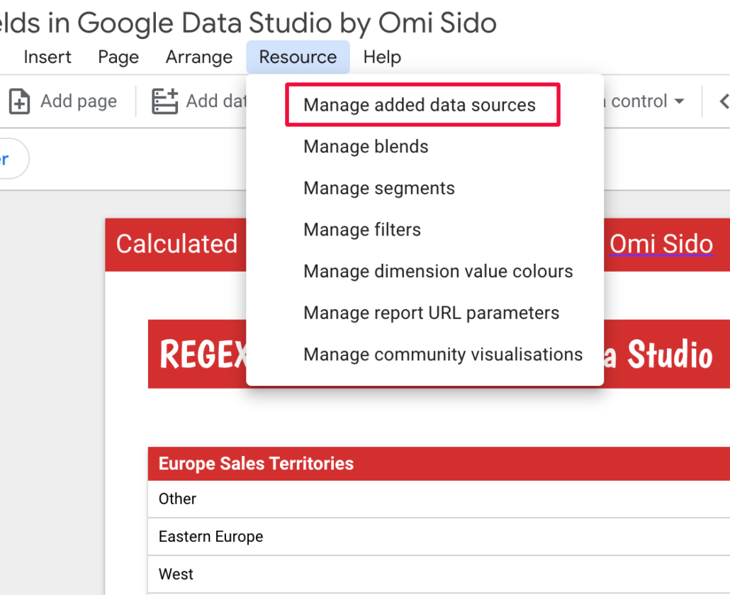
- Navigate to ‘Resources” and then click on ‘Manage added data sources”.
- Select the Data source you’re using for your report. In this example, as I am using the Google Analytics sample dataset the Data Source is called ‘Master View’ so I click ‘Edit’.
- Under ‘Actions’ click ‘Edit’ (if you have more than one Data source you have to edit them separately).
- Click “ADD A FIELD’ and insert your formula in the provided window. Google will also give you a random Field ID but don’t worry too much about it as the actual ID number is not important. If there is an error in the calculated field formula, Data Studio will show you a warning message, and you won’t be able to save the field.
Note: Always name your custom fields with something descriptive so that you know which is which in your reports.
Top 10 Most Useful Calculated Fields and Functions in Looker Studio (Data Studio)
Now that we know what Calculated Fileds are in Google Looker Studio (Data Studio) and how to create one let’s talk about some of the most common use cases.
Find all the examples by clicking on the picture below or the link beneath it. Copy the free Dashboard that I’ve built and utilise its various sections for your projects.
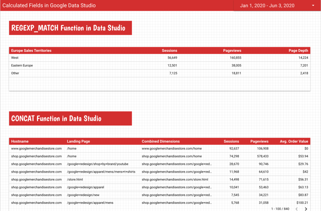
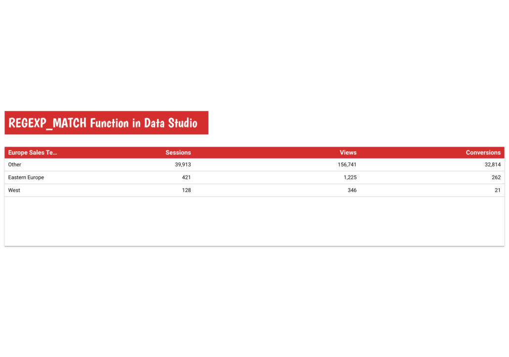
REGEXP_MATCH Function in Google Looker Studio
I find the REGEXP_MATCH Function to be very practical when aggregating data based on existing dimensions, including custom groupings of pages, geographic regions, or traffic sources.
Let’s say you are part of a sales team for an international company and you are in charge of Europe. And then imagine that the sales territories of your company are organised by West Europe and Eastern Europe.
Using the REGEXP_MATCH Function you can create a new dimension – let’s call it ‘Europe Sales Territories’ that will help you to group the countries into West Europe and Eastern Europe.
CASE
WHEN REGEXP_MATCH(Country, "Germany|United Kingdom|Switzerland|Spain|France|Ireland|Italy|Sweden|Portugal|Denmark|Austria|Norway|Finland|Malta|Iceland|Luxembourg|Jersey|San Marino|Guernsey|Andorra|Liechtenstein|Faroe Islands|Gibraltar|Monaco|Åland Islands") THEN "West"
WHEN REGEXP_MATCH(Country, "Ukraine|Bulgaria|Greece|Romania|Belarus|Sweden|Slovakia|Croatia|Serbia|Russia|Poland|Czechia|Estonia|Latvia|North Macedonia|Moldova|Albania|Kosovo|Montenegro") THEN "Eastern Europe"
ELSE "Other"
END
By utilising the formula above, you will be able to observe the performance of these two parts of Europe in comparison to each other.
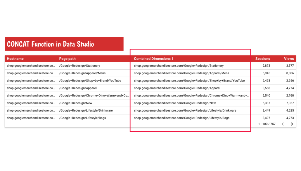
CONCAT function in Google Data Studio
The CONCAT function allows you to join various strings from your data together so you can end up with a more compact and more informative ‘new’ dimension. You can add as many dimensions as you want but make sure that the ‘new’ dimension is useful to you.
A good example of using the CONCAT function would be when you have multiple domains or sub-domains within your website and you want to see the full URL of the page in your Google Looker Studio Dashboards.
I will call this new dimension “Combined Dimensions 1” and the formula is:
CONCAT(Hostname, Page path)And the result is:
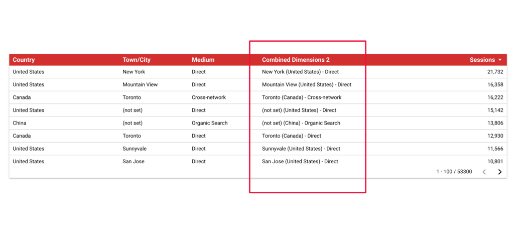
Another good usage of the CONCAT function would be to build a new segment separating our visitors into segments based on their city and how the channels they used to find our pages.
I will call this new dimension “Combined Dimensions 2” and the formula is:
CONCAT(Town/City," (",Country,")"," - ",Session default channel grouping)And the result is:
REGEXP_REPLACE function in Google Looker Studio
The REGEXP_REPLACE function is often used when we want to strip the parameters of a landing page and only want to see the traffic to that page.
In the example below I used the following formula to strip everything after the ‘?”.
REGEXP_REPLACE(Page path + query string, "(\\?).*", "") I named the calculated field ‘Removing Query Parameters”.
And the result is:
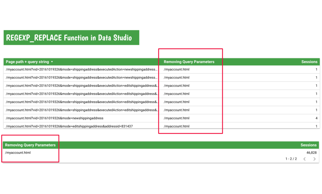
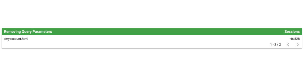
As you can see in the second table by using the REGEXP_REPLACE function I can combine the traffic to the landing page (I removed the dimension “Page path + query string”).
Note: To learn the basics of Regex go to this website https://regexone.com/.
Using the REGEXP_REPLACE function to consolidate values
Another good use of the REGEXP_REPLACE function would be consolidating a value when there is fragmented data due to inconsistent naming conventions.
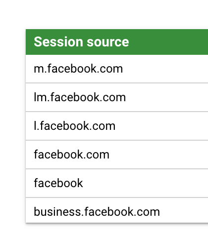
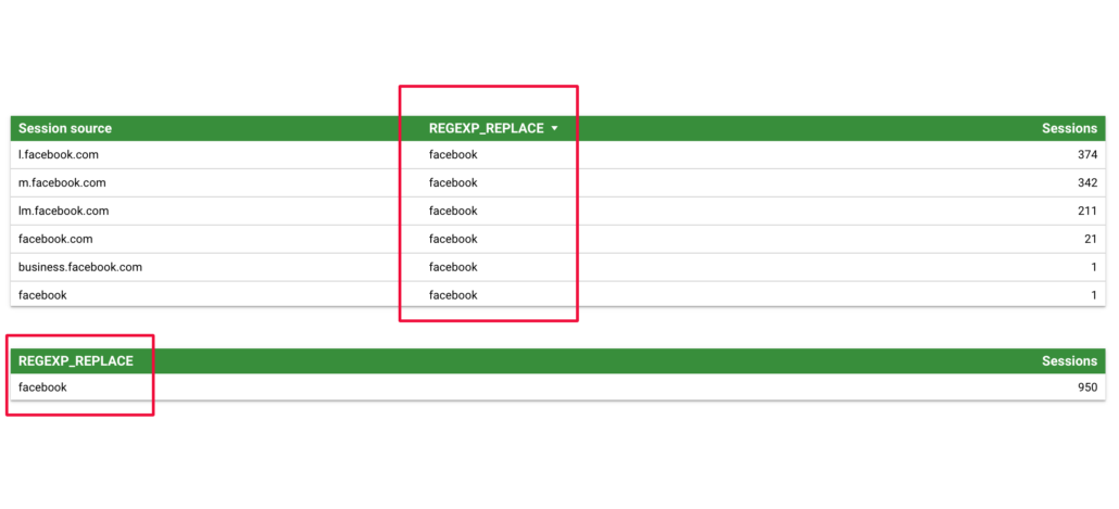
In the following example, I used the formula below to consolidate all Facebook referral sources.
REGEXP_REPLACE(Session source, '(?i)((l|m|lm|business)\\.)?facebook\\.com', 'facebook')In the same manner as the previous example, using only our ‘new’ dimension provides a ‘clean’ view in the second table of all visitors coming to our website with Facebook as the source.
CASE Function in Google Looker Studio
Last but not least is my favourite way of creating ‘custom fields’ in Google Looker Studio: Case Statements.
Before giving you some examples let’s talk a little bit about the rules and limitations of using the Case Statements in Looker Studio.
The syntax of the CASE statement is pretty simple:
CASE
    WHEN condition THEN result
    WHEN condition THEN result
    ELSE result
END
Rules and limitations of the CASE statement in Data Studio
- You can only add CASE statements to your Data Studio if you are able to modify the data source on which it will be added.
- When using Data Studio in different languages you may have to adapt some of the fields, e.g. COUNTRY will be PAYS in French.
- You can’t compare dimensions to dimensions or metrics to metrics. You can compare a dimension or metric only with a literal value.
- calculated fields can’t mix metrics (aggregated values) and dimensions (non-aggregated values)
Now that we know what the CASE Statement is and it’s limitations let me show you some of my favourites CASE use cases (pun intended).
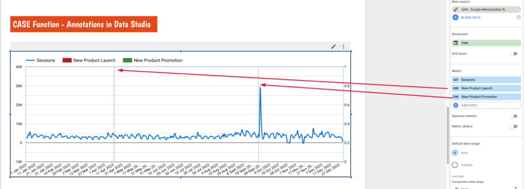
Annotations in Google Looker Studio using the CASE statement
If you ever wanted to annotate your charts so you can explain shifts (important events) in your data as of today the only way to do that in Google Looker Studio is to use the CASE function.
Start by creating a calculated field and naming it after the event you want to annotate. In my example, I named the event ‘New Product Launch’ (I was born on 12th April, so the name makes a lot of sense, lol).
Use the following formula:
CASE
WHEN Date=DATE "2023-04-12" then 1
else 0
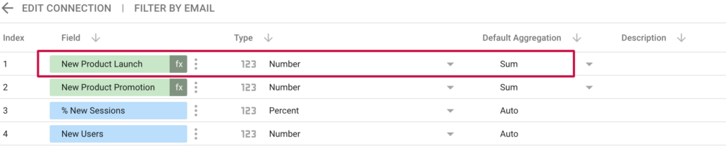
END In simple words what we are doing here is specifying the date we want to annotate and giving it a value of 1. After creating the new metric go to the list of fields in your data and make sure the aggregation type is set to ‘Sum’.
Finally before using the new metric go to the ‘LAYOUT’ setting and set the Series #2 data to display on the right axis, and display as a bar.
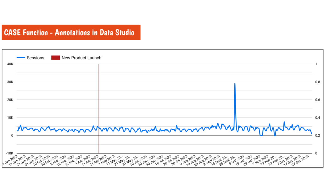
If you want to add more than one annotation simply duplicate this metric, adjust the dates and give it a new name.
Custom Content Grouping in Looker Studio
Custom content grouping allows you to allocate a set of pages to a logical grouping and then report on them as a collective. For example, all pages where the path contains /shop can be grouped as Shop and all pages that contain /article can be grouped as Articles.
Segmenting your URLs by type will allow you to:
- group landing pages together by subfolder or URL, e.g. Product Pages, Category Pages, Blog Pages, etc.
- Clearly see which segments are performing the best or the worst.
- Display clicks, impressions and CTR by segment so you can make accurate segment over segment comparison.
Custom content grouping is very useful when assigning custom content segments to historical data (after website migration, category renaming etc.) as you can assign any past and current category to a custom segment, e.g. you can assign both old /red-shoes/ and new /leather-red-shoes/ categories to the same segment ‘Leather Red Shoes’.
CASE
WHEN REGEXP_MATCH(Landing Page, "/red-shoes/") then "Leather Red Shoes"
WHEN REGEXP_MATCH(Landing Page, “.*/leather-red-shoes/.*”) then "Leather Red Shoes"
ELSE "Other"
End
In my dashboard, I used the following formula to apply custom content segmentation the Google Shop URLs.
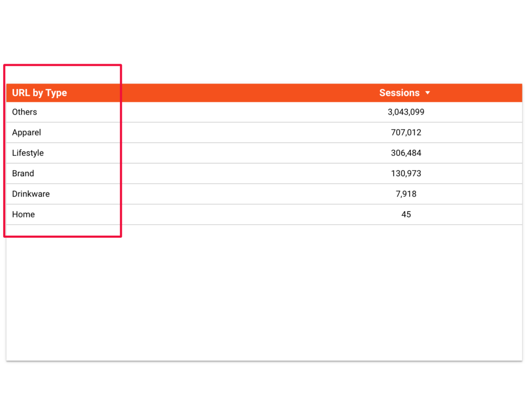
CASE
When REGEXP_MATCH(Page path, ".*/.*Apparel.*|") then "Apparel"
When REGEXP_MATCH(Page path, ".*/.*Lifestyle.*|") then "Lifestyle"
When REGEXP_MATCH(Page path, ".*/.*Drinkware.*|") then "Drinkware"
When REGEXP_MATCH(Page path, ".*/.*Brand.*|") then "Brand"
When REGEXP_MATCH(Page path, ".*/.*Home.*") then "Home"
else "Others"
End
Using the formula above you can go from this
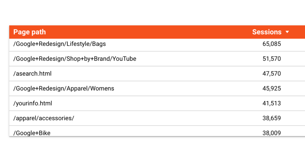
to that:
Note:
- .* is used in the REGEX to include everything before and after
- | means “or” and is used to include more words to take into account
Revenue Targets using the Case Statement in Looker Studio
As you can see from the previous example knowing the revenue by category is a good thing but what if I wanted to know whether I am meeting my revenue targets or not. Or in other words, how to report against targets in Google Looker Studio.
From what we’ve already learnt about the CASE Function in Google Looker Studio completing this task is actually very easy. All we have to do is assign a value (expected revenue targets) to a previously made custom segment – in our case Apparel, Lifestyle, Brand etc. – using the following formula:
CASE
When REGEXP_MATCH(Page path + query string, ".*/.*Apparel.*|") then "Apparel"
When REGEXP_MATCH(Page path + query string, ".*/.*Lifestyle.*|") then "Lifestyle"
When REGEXP_MATCH(Page path + query string, ".*/.*Drinkware.*|") then "Drinkware"
When REGEXP_MATCH(Page path + query string, ".*/.*Brand.*|") then "Brand"
When REGEXP_MATCH(Page path + query string, ".*/.*Home.*") then "Home"
else "Others"
End
After creating our new field using a CASE statement, the default Type will be “Text”. We need to change this to Currency.
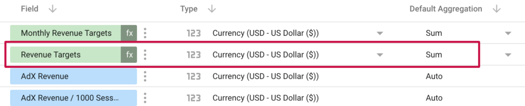
We also have to change the ‘Default Aggregation’ to “Sum”.
Using the newly created field in our Google Looker Studio reports will give us the following table.
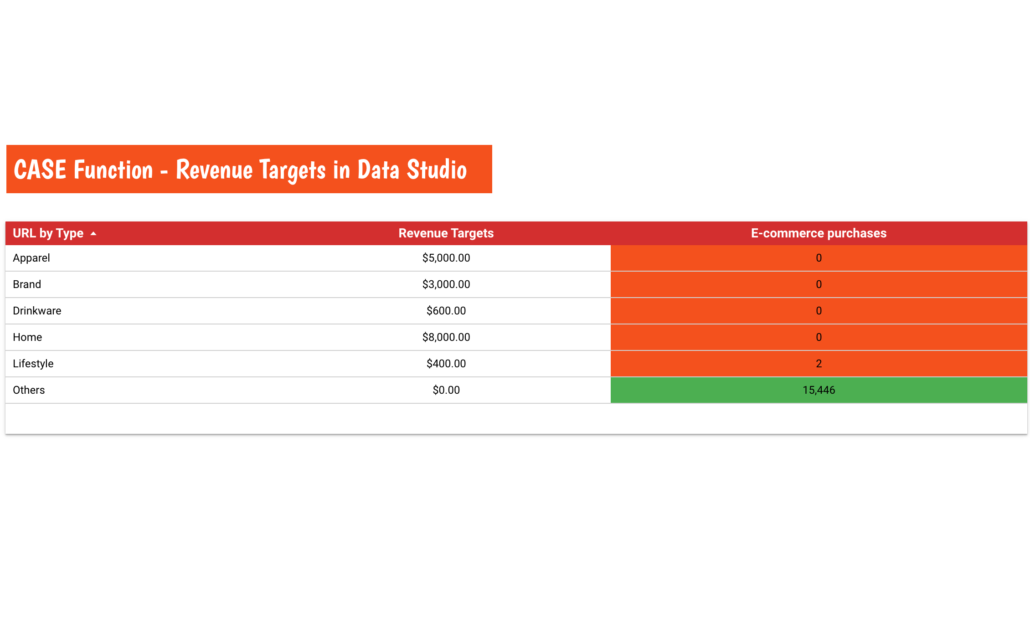
To make things a bit more visual I also applied Conditional Formatting to the table in order to highlight which categories achieved their targets, and which did not.
In the “STYLE’ tab of this table under “Conditional formatting’ I added two rules.
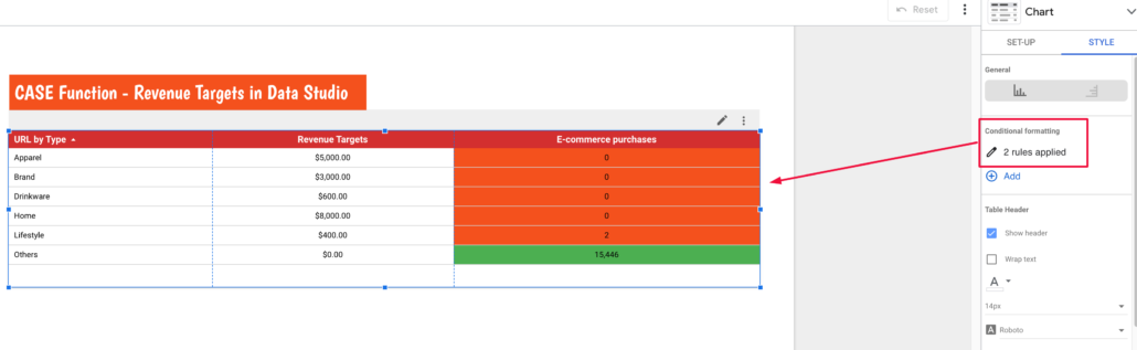
The first rule sets any value in the ‘Revenue’ column greater than its corresponding value in the ‘Revenue Targets’ column as Green.
The second rule sets any value in the ‘Revenue’ column lower than its corresponding value in the ‘Revenue Targets’ column as Red.
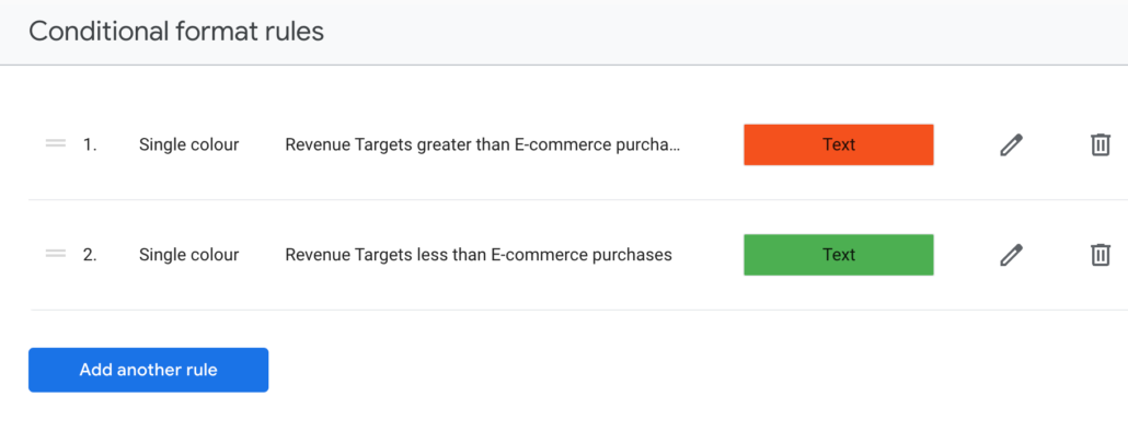
Now we can clearly see how our categories are performing against our revenue projection.
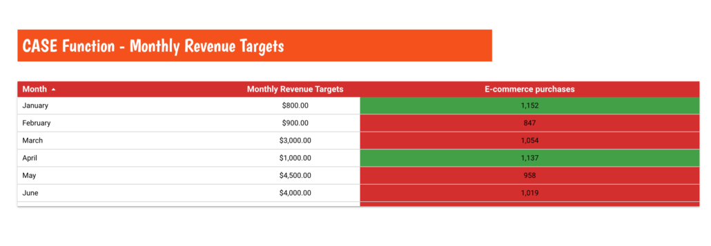
Monthly Revenue Targets using the Case Statement
When it comes to reporting, context matters.
I don’t know about you but I normally do my reporting on a monthly basis. So applying the same logic I can assign revenue targets to every month and then compare them to the actual monthly revenue.
Or in simple words, we want to write a CASE statement that says when the month = x the target = y.
CASE
    WHEN MONTH(Date) IN (1) THEN "2000"
    WHEN MONTH(Date) IN (2) THEN "900"
    WHEN MONTH(Date) IN (3) THEN "3000"
    WHEN MONTH(Date) IN (4) THEN "1000"
    WHEN MONTH(Date) IN (5) THEN "4500"
    WHEN MONTH(Date) IN (6) THEN "4000"
    WHEN MONTH(Date) IN (7) THEN "2700"
    WHEN MONTH(Date) IN (8) THEN "800"
    WHEN MONTH(Date) IN (9) THEN "1900"
    WHEN MONTH(Date) IN (10) THEN "3400"
    WHEN MONTH(Date) IN (11) THEN "3800"
    WHEN MONTH(Date) IN (12) THEN "4200"
END
Again I’ve applied Conditional Formatting so my stakeholders can spot ‘good’ and ‘bad’ moths at first glance.
Bonus Tip:
Practice makes perfect! Experiment with different CASE scenarios to solidify your understanding and unlock its full potential.
IF function in Google Looker Studio
What is the IF function?
Think of the IF function as a decision-maker. It evaluates a condition and based on the outcome which can be true or false, returns one of two values.
The basic syntax of the IF function in Looker Studio is as follows:
IF(condition, value_if_true, value_if_false)- condition: The logical expression that evaluates to true or false.
- value_if_true: The result or value to return if the condition is true.
- value_if_false: The result or value to return if the condition is false.
Why use the IF function in Google Looker Studio?
The IF function shines when you need to:
- Segment your data: Sort customers into tiers based on spending, categorise website visitors by their source, or group products by popularity.
- Apply custom logic: Calculate discounts based on specific criteria, highlight outliers in your data, or create dynamic labels based on values.
- Simplify complex calculations: Break down intricate logic into smaller, easier-to-understand IF statements.
Simple IF statement
Let’s consider a scenario where we have a sales dataset, and we want to categorise sales coming from different cities as ‘Gold’ if the amount is greater than $300, and ‘Silver’ otherwise.
IF (E-commerce purchases > 300, "Gold", "Silver")In this example, the IF function assigns ‘Gold’ tier to cities with sales exceeding $300, and ‘Silver’ to cities with less than $300.
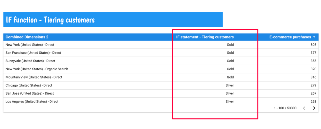
Notice that I used the ‘Combined Dimension 2’ that we created earlier using the CONCAT function.
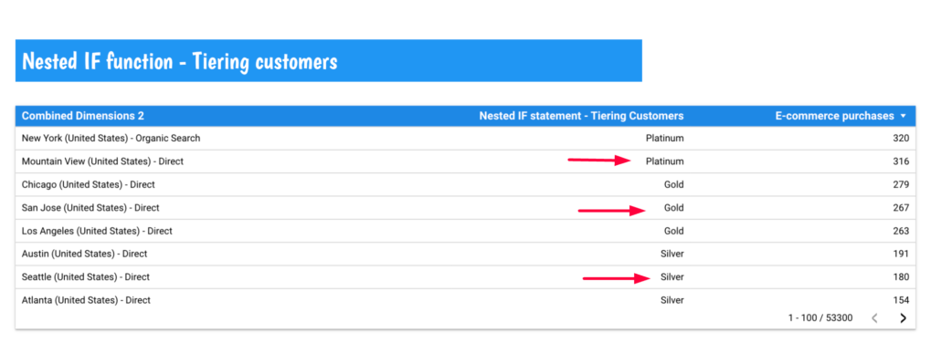
Nested IF Statements
The example above is very powerful but for more complex conditions we have to use nested IF statements. Suppose we want to categorise sales as ‘Platinum’, ‘Gold’ or ‘Silver based on different threshold values then we have to nest IF statements within each other.
IF(E-commerce purchases > 300, 'Platinum', IF(E-commerce purchases > 200, 'Gold', 'Silver'))The formula above will separate our cities into Platinum, Gold or Silver.
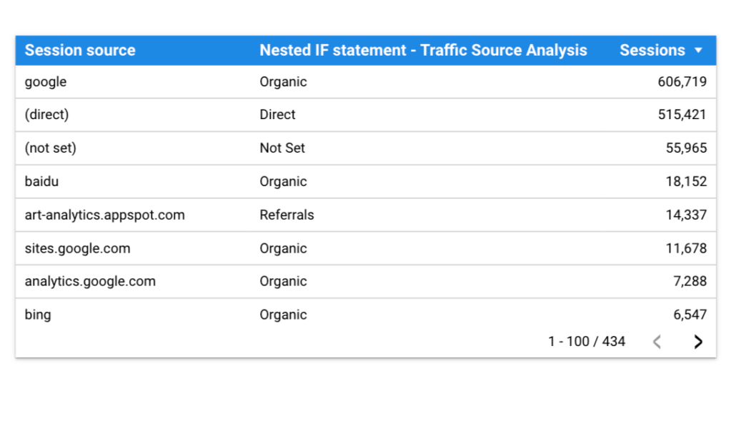
Another good example would be to use the IF function to analyse your traffic based on source.
IF (REGEXP_CONTAINS(Session source, "google|bing|yahoo|baidu|yandex"),
"Organic",
IF (REGEXP_CONTAINS(Session source, "youtube|linkedin.com|facebook|reddit|instagram|pinterest|tiktok"),
"Social Media",
IF (REGEXP_CONTAINS(Session source, "(adclick)"),
"Paid Search",
IF (REGEXP_CONTAINS(Session source, "(direct)"),
"Direct",
IF (REGEXP_CONTAINS(Session source, "(not set)"),
"Not Set",
IF (REGEXP_CONTAINS(Session source, "Newsletter|newsletter"),
"Email marketing",
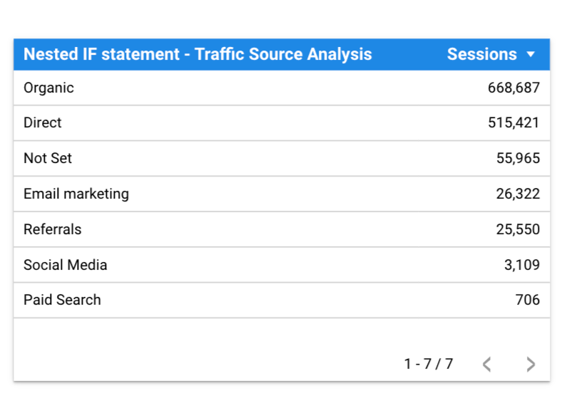
"Referrals"))))))Using the formula above you can go from this
to this
Remember:
- Adapt these examples to your specific data and needs.
- Use clear and concise variable names for better readability.
- Test your calculations thoroughly to ensure accurate results.
- Consider alternative functions like CASE or SWITCH for cleaner nested logic.
I hope these examples help you unlock the power of nested IFs in Google Looker Studio!
Add-on 18.02.2002
Operators
Arithmetic operators
Addition: +
Subtraction: -
Division: /
Multiplication: *
Comparison operators
Addition: +
Subtraction: –
Division: /
Multiplication: *
Phew.
If you’re still with me, congratulations. I know the above steps weren’t easy. But if you followed my advice – and hopefully recreated all the tables above – you just made it very easy to create visual reports from your data for months and years to come.
Calculated fields in Google Data Studio are a great way to make data, including Google Analytics data, more informative, insightful, and easier.
When they add REGEX_EXTRACT or IFS in the Calculated fields then it will be even better!
Wow, this is gold. I was looking for a long time for a solution to manipulate values in datastudio, from eventID’s to event names. This is exactly what I needed! Thank you for the clear explanation.
Can anyone tell me how to extract the Return Visitors from User Type? I need it as an integer, not a percentage, to go in a score card. Cannot find any information on this and I’ve been searching for days. I can’t even find how to extract the percentage from User Type. How do you split an aggregated value..?
Anyone..?