I probably don’t need to tell you that the world of search engine optimisation (SEO) is constantly evolving, with new updates and changes being made to search engine algorithms and best SEO practices. One of the more recent changes that have had a massive impact on SEO is the shift towards mobile-first indexing. So let’s have a quick discussion about what mobile-first indexing is, why it is important to your business, and how you can optimise your website for it.
What is Mobile-first indexing?
Mobile-first indexing is exactly what it sounds like – it’s an indexing system that prioritises the mobile version of your website over its desktop counterpart. In the past, search engines like Google would primarily crawl and index desktop versions of websites, and mobile versions were seen as secondary. However, with the rise of mobile usage and the fact that more people are accessing the Internet from their smartphones and tablets than ever before, it makes sense that search engines would want to prioritise mobile versions of websites.
Ultimately, Google wants to improve the user experience of their customers and to do that our websites should perform well on mobile devices.
Prepare for mobile-first indexing
So, what does this mean for website owners and SEO professionals? Essentially, it means that if your website isn’t optimised for mobile, you’re going to have a hard time ranking well in the search engine results pages (SERPs). This is because from now on Google (and other search engines) will prioritise websites that are mobile-friendly since they know that a majority of their users are accessing the Internet (your web pages) from their mobile devices.
How Google’s Mobile-First index affects businesses
The impact of mobile-first indexing can be seen in several ways. Firstly, if your website isn’t optimised for mobile, you may notice a decrease in your search engine rankings (a decrease in organic visibility). This is simply because search engines will assume that your website isn’t user-friendly for mobile users and will, therefore, be less likely to display it to people searching on their phones or tablets.
Secondly, even if your website manages to rank well in SERPs, if it’s not optimised for mobile, you may notice a decrease in traffic and conversions. This is because mobile users are less likely to stay on a website that isn’t easy to navigate or read on a small screen. They are also less likely to buy from a website that isn’t easy to navigate and I know that from my own experience.
How to optimise for Mobile-first indexing?
So, how can you optimise your website for mobile-first indexing? There are several best practices that you can follow to ensure that your website is mobile-friendly and optimised for search engines. Some of these include:
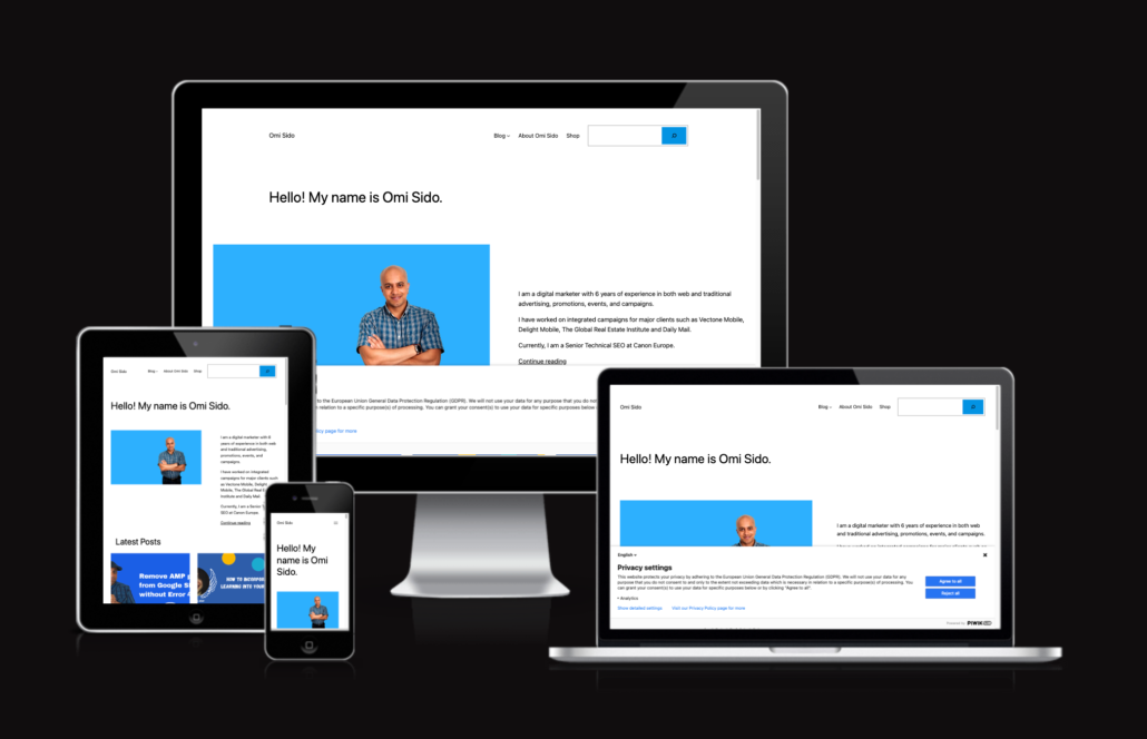
- Use a responsive design: A responsive website design is one that adjusts to fit the screen size of the device it’s being viewed on. This means that whether someone is accessing your website from a desktop computer or a smartphone, the website will automatically adjust to fit the screen size and provide a user-friendly experience. In other words, you have to adopt a web development approach that creates dynamic changes to the appearance of your website, depending on the screen size and orientation of the device being used to view it.
- Optimise your images: Images are an essential part of any website, but they can be particularly problematic for mobile users if they’re not optimised correctly. Make sure that your images are compressed and scaled appropriately for mobile devices so that they load quickly and don’t take up too much space on the screen. Optimising your images will also help you a lot when it comes to page speed as a ranking factor. To measure the impact of images on mobile speed use tools like PageSpeed Insights and GTmetrix.
- Simplify your navigation: Mobile users don’t want to scroll through a long list of links to find what they’re looking for. Ensure that your website’s navigation is simple and easy to use, with clear menus and buttons that are easy to tap on a touchscreen.
- Use mobile-friendly fonts and font sizes: Fonts that look great on a desktop computer may be difficult to read on a small mobile screen. Ensure that you’re using fonts that are easy to read on a mobile device and that you’re using font sizes that are appropriate for small screens. A widely accepted guideline for touch target size is a minimum of 44 pixels wide and 44 pixels tall.
- Test (and test again) your website on multiple devices: Just because your website looks great on your phone or tablet doesn’t mean it will look good on all mobile devices. Ensure that you test your website on a variety of devices to ensure that it’s optimised for all screen sizes and resolutions. My starting point is always Am I Responsive?
In addition to these best practices, several tools and resources are available to help you optimise your website for mobile-first indexing. For example, Google’s Mobile-Friendly Test is a free tool that allows you to test your website’s mobile-friendliness and provides suggestions for improvement. You can also use Google Analytics 4 to track your website’s mobile traffic and see how mobile users are interacting with your website. This data can help you identify areas for improvement and make changes to your website’s design and content to better meet the needs of mobile users. After every change you make you should test again(!)
Mobile-first indexing is not the only ranking factor but it’s an important one
It’s also worth noting that while mobile-first indexing is an important consideration for SEO, it’s not the only factor that search engines take into account when ranking websites (people say that Google ranks webpages using more than 200 ranking factors). Factors like the relevance and quality of your content, the number of backlinks pointing to your website, and the user experience (UX) on your website are also important considerations. However, with mobile usage continuing to increase (just look at the mobile usage statistics), it’s essential to prioritise mobile optimisation to ensure that your website is as user-friendly as possible for all visitors.
In conclusion, mobile-first indexing is a significant shift in the world of SEO that website owners and SEO professionals need to pay attention to. By prioritising mobile optimisation and following SEO best practices for mobile-friendly design and content, you can ensure that your website is optimised for search engines and user-friendly for all visitors. With mobile usage continuing to rise, it’s more important than ever to prioritise mobile optimisation and stay ahead of the curve when it comes to SEO best practices.
Who is Cindy Krum?
Cindy Krum is the Chief Executive Officer of MobileMoxie, LLC (Previously Rank-Mobile LLC). She brings fresh and creative ideas to her clients, speaking at national and international trade events about mobile web marketing, social network marketing and international SEO.
Cindy Krum also writes for industry publications, and has been published in Website Magazine, Advertising & Marketing Review, Search Engine Land, ODG Intelligence, and quoted by many respected publications including PC World, Internet Retailer, TechWorld, Direct Magazine and Search Marketing Standard.
About BrightonSEO
BrightonSEO – is a major search marketing event in the UK. One of our favourite events of the year, This is a superb conference for search marketing professionals, novice or expert.
BrightonSEO is a chance to learn from some of the best minds in search, and then rub shoulders with them at one of the friendliest, and largest, gatherings of Digital Marketers in Europe.
4 responses